
| 2024-25
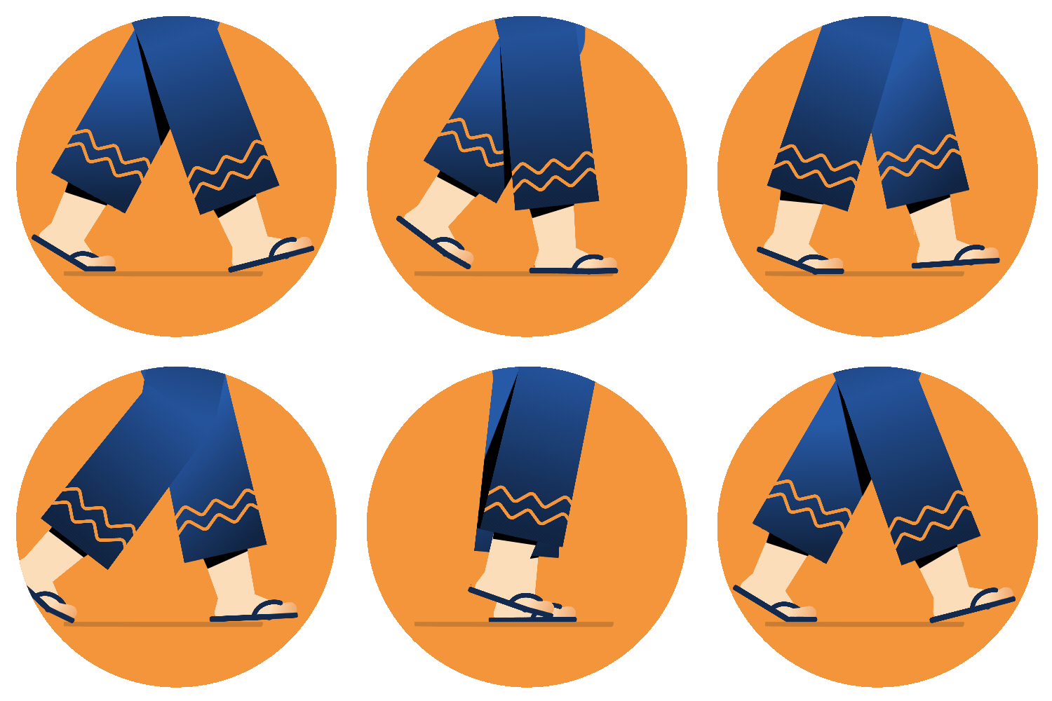
Driving New Behavior and brand perception with Walk & Save
Responsibilities & Activities
-
Planning & scoping with PM
-
Adapting design process to meet fast pace delivery timelines.
-
Aligning stakeholders
-
Mentoring designers
Skills
-
Creating vision, plans & strategy
-
Cross functional collaboration
-
Problem solving
-
Design system component building
-
User Testing & Observation
Rapido is a ride-hailing company currently facilitating over 6 million rides daily. Rapido operates on a platform model that doesn't allow for direct discounting. But in a market where price is one of the most important factors in a user's decision to book, we needed to find a meaningful way to lower what people paid.
Before the feature — the design problem
Design wasn't trusted here — and honestly, it hadn't earned it yet.The work reflected aesthetic preferences, not user reality. Research stayed indoors. Walk & Save became the project where I was able to changed both.
Problem hiding in plain sight
A captain traveling the wrong way still gets assigned. He makes a U-turn, adds a kilometre, and arrives late. The user pays more — and never knows why. The inefficiency existed on both sides, and neither side could see it.
Will users understand the concept & be willing to walk for a lower fare?

The first version didn't work. Here's what it told us.
We started by adding Walk & Save to the pickup selection screen — the moment users already make their pickup decision. It felt like the right place. But adoption was nearly zero.
The screens told us why. The feature was present — but invisible. Following problems were making it impossible for users to engage, even when conditions were right.

The room we weren't in
Design wasn't part of the problem-solving. We were brought in to execute. When the first version didn't perform, the blame landed on design.
That was a choice point. We could defend the work. Or we could change what design meant in this team.
Going to the ground
I didn't push for a redesign first. I pushed for a research trip — and I wanted stakeholders in it.
Getting buy-in wasn't easy. The belief was that research happened indoors. Going out felt unnecessary. Even the design team resisted — live interception was uncomfortable. Users mid-booking didn't want to be stopped. Some people came back from the field having been spoken to rudely.
But what they brought back was irreplaceable. 60+ conversations - Things the data had never surfaced. And because we were able to take PMs and leadership alongside us — shared understanding replaced the need to sell recommendations.
Design finally had a seat at the table. Not because we asked for it. Because we'd earned it.
What the ground taught us
Most people won't opt in — and that's fine.
Ride hailing apps have trained users to expect doorstep pickups. Energy, luggage, mood shapes the decision.
How might we present this concept to the users & help them make a decision.
The feature was invisible
It lived on a screen built for a different decision. It needed its own moment.
Walk & Save needed to feel different — because it was different.
Branded as 'Walk & Save.'
The branding was deliberate — a distinct visual language that interrupted the familiar booking flow just enough to say: something new is available here. The transition screen created a pause. The Walk & Save page made the trade explicit — distance, time, saving — before asking users to commit.
Nothing on this screen was decorative. Every element was answering one of the four principles we'd defined on the ground.



Service selection
Walk & Save Transition
Walk & Save Page

1/4th of users chose to walk for a lower fare.
The next question was whether the same mechanic could solve a different problem entirely.
In dense urban areas — narrow lanes, congested bylanes — captains were avoiding pickups altogether. Low accessibility meant low fulfilment. Users were booking from addresses vehicles couldn't easily reach, and rides were falling through.
We redeployed Walk & Save with a shifted frame. Not just a lower fare — a faster pick up. Walk a short distance out of the lane, reach a high fulfilment zone, get picked up faster.
Same behaviour. Different motivation. The design didn't change much. The context did everything.

The commitment doesn't end at the tap.
Selecting Walk & Save is one decision. Actually walking there is another.
Once a captain was assigned, users who hadn't reached their pickup point got a nudge — with street view, walking path, and orientation guidance. Not to pressure them. To make the walk feel doable.


Impact & Social VOC
31% users chose to walk for a lower fare.
7% reduction in drop off post captain accepting the ride
3% retention : Users who experienced this feature came back and booked again
Link to the post


What this taught me
Behaviour change doesn't announce itself. It accumulates.
There were stretches where adoption felt flat, stakeholders felt unreachable, and the work felt invisible. No clear signal. No obvious next move. Just the slow, unglamorous work of staying consistent when the results hadn't caught up yet.
Keep moving forward — in ambiguity — is the only way through.
What made it harder was not knowing who we were solving for. You don't always get a clear target. Sometimes the problem statement is vague, the audience is undefined, and the only honest answer to "who is this for?" is — we think we know, but we'll find out.